Component Options
Component Options
Below the component tree in the Designer interface you can find the options that affect a specific instance of a component type used in an Alyvix test case object . Whenever you select a row in the component tree, these options will be updated to reflect the options currently assigned to that row’s component.
Root Component Options
The root element options take effect when the test case object is first executed. These options allow you to set up the proper environment for the application you want to automate, which is especially helpful when a test case object will be the very first scripted node.
For instance, you might want to start a particular application like a web browser before Alyvix begins looking for any particular components on the current screen, and then close the browser with the final test case object.
The root component options can be found at the bottom of the Designer interface when the root node S is selected:
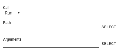
The Call dropdown tells Alyvix what action to perform when the test case object is executed:
Run: Start a Windows application
Kill: Terminate a running application
None: Don’t do anything
To start an application, you will need to tell Alyvix where to find it, and what arguments to pass. For instance, you could start a web session with a particular browser and with a specific URL as an argument. To do this, select Run and set its two parameters:
Path: Use the button to bring up a file selection dialog to find the application in the file system, or else type the full path for an executable file in your system
Arguments: Here you can enter the arguments the application expects when it starts up – the button will let you insert a file with its full path, but replaces the existing content, so use it first before adding any other arguments
If you paste a path into the Path field instead of using the button, you should not include any quotation marks even if there are spaces in the path.
The Kill option instead allows you to select a currently running process to terminate, or type one in if it’s not currently running:
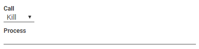
It provides a filtered dropdown named Process, populated with all currently running Windows processes, allowing you to make a quick selection with just a few keystrokes.
Note
If you launch an application with the Run or Kill option, you can still recognize child components in the application’s interface within the same test case object.
 Image Type Options
The image component corresponds to the pixel-by-pixel representation of the selection or subselection on the captured screen, such as an icon. As shown here, it has the following options to choose which visual aspect of the image to match against (an Operations tutorial video is available that explains the image options):
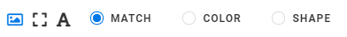
Match: Only recognize an area on the screen that is exactly the same as the one selected during screen capture
Color: Match a selection or subselection that has the same color, but tolerate different pixels
Shape: Match the same shape as the contours of the object in the screen capture region, regardless of its color
 Rectangle Type Options
The rect component corresponds to a rectangular region on the captured screen, such as buttons, text boxes, panels or windows. As shown here, it has the following options (an Operations tutorial video is available that explains the rect options):
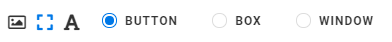
Button: Match a region such as a button containing text, within a larger space
Box: Match a horizontal region such as a text field, where the space is filled up from the left edge to the right edge
Window: Match a panel or a window, both horizontally and vertically, where the region of interest and the selection are the same
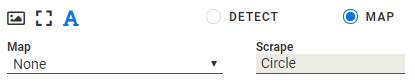
 Text Type Options
The text component corresponds to an area on the captured screen containing characters, such as a label, title or text in an input field. As shown below, it has the following options, which vary depending on the type selected.
For both the Detect and Map types, the Scrape field displays the text that was automatically recognized in the component’s subselection on the screen capture. There are some limitations to note:
The main component of a group cannot be of type Text
The region-of-interest must contain at least 2 characters (in general, text recognition improves as the amount of text in the RoI increases, and with larger fonts and increased screen resolution)
Detect
The text type’s Detect option will determine that a match was correctly made if the text scraped from the region of interest matches the condition specified in the first two fields.
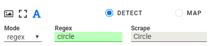
The Mode dropdown determines how the text is interpreted, setting the criterion to one of these 3 methods:
Regex The scraped (recognized) text is considered matched only if it satisfies the regular expression in the Regex field, once normalized as lower cased strings. (An Operations tutorial video is available that explains the regex options). The regular expression syntax is governed by the Python Regular Expression library .
A green background color in the Regex field indicates the regex matches the scraped text, red means it does not match, and yellow indicates a syntactically well-formed special construct that will potentially match a to-be-determined external value.
Number The recognized text is considered matched only if it results in a number that satisfies the condition selected in the Logic field (e.g., “greater than zero”).
Date The recognized text is considered matched only if it results in a day and time that satisfies the time interval selected in the Logic field (e.g., “last hour”, “last day”, etc.)
Map
When Map mode is selected, the scraped text will be mapped to the most similar key in
the chosen map
(the Map can be selected in the map interface in Editor),
and the value that corresponds to that key in the map will both be returned and be cached in the
test case object. If the {<object>.extract}
pattern is used later
in the String field of another test case, this cached value will be returned.
Common Options
For all group and component object types, once a match on the screen has been found, you can optionally set up an immediate mouse and/or keyboard action which is unique to each component. The actions on all components in a group will be performed in the top-to-bottom order found in the component tree.
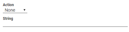
An Action creates a mouse event corresponding to one of the six types listed below (an Operations tutorial video is available which explains the individual Action options). By default, the mouse position will be set to the center of the component’s selection or subselection.
None (default): Don’t perform any mouse action when a component is matched. No mouse icon will be displayed to the right of the component.
Move: Hover the mouse over the component, without clicking. The SET POINT button lets you select a point relative to the center of the component with the crosshairs.
Click: Move the mouse over the component (use SET POINT as with Move), and then click one or more times at that point. You can choose the left or right mouse button and the number of times to click (Units). If you select more than one click, you can then set the delay in milliseconds between each click.
Scroll: Move the mouse to the position indicated by the SET POINT button, then pick a direction (up, down, left or right), and indicate how far and how fast the object containing that point should be scrolled. A unit represents an application-dependent measure of how far the screen will scroll, typically the distance moved when the mouse scroll wheel makes one partial turn. If it is set to more than one scroll unit, you can then set the delay in milliseconds between each scroll.
Hold: Move the mouse to the position indicated by the SET POINT button, then create a mouse event where a click is initiated but the mouse button is still held down.
Release: If the Direction is set to
None, then move the mouse to the position indicated by the SET POINT button. Otherwise choose a direction (up, down, left or right) and the distance in pixels to move before releasing the mouse button.
The String option enters text into the text field in the interface that currently has focus (it will occur after the effect of any Action above), for instance in a login/password field. It can also emit special characters such as the Windows key. For more detailed information, see the following page that describes the String field.
Mouse and Keyboard Action Icons
When one of these options is selected, an icon will appear to the right of the component as a quick indication of that option and its parameters. The following table illustrates the icons used and their meanings.
Mouse and Keyboard Action Icons
Icon |
Description |
|
Move the mouse to a new position |
|
Click the left mouse button |
|
Click the right mouse button |
|
Scroll downwards |
|
Scroll upwards |
|
Hold the object under the mouse |
|
Release the held object where it is |
|
Release the held object upwards |
|
Release the held object downwards |
|
Release the held object leftwards |
|
Release the held object rightwards |
|
Enter text into the field in focus |
|
Enter parameterized text into the field in focus |
Tip
When using SET POINT, the direction of the arrow to the right of the icon is
indicative of the direction of the point that was set compared to the center of the selection
or subselection. For instance, an arrow like  means the click
point will be below and slightly to the left of the selection.
means the click
point will be below and slightly to the left of the selection.